home › Forums › Art & Artwork › Open Critique › Plaster Cast Drawings
- This topic has 14 replies, 9 voices, and was last updated 3 years, 1 month ago by
 Jeffrey Sawyer.
-
AuthorPosts
-
February 4, 2021 at 8:47 am #1161374February 16, 2021 at 2:21 pm #1198545February 16, 2021 at 2:23 pm #1198566February 16, 2021 at 2:25 pm #1198569February 17, 2021 at 11:04 am #1200775
Nice work Jan on all the casts!
February 17, 2021 at 3:15 pm #1201063they look great (:
February 17, 2021 at 10:31 pm #1201459Thank you jan for you lovely comment on my pic. I like your work on the casts. Nice mark making and form, I can see I have a lot to learn.
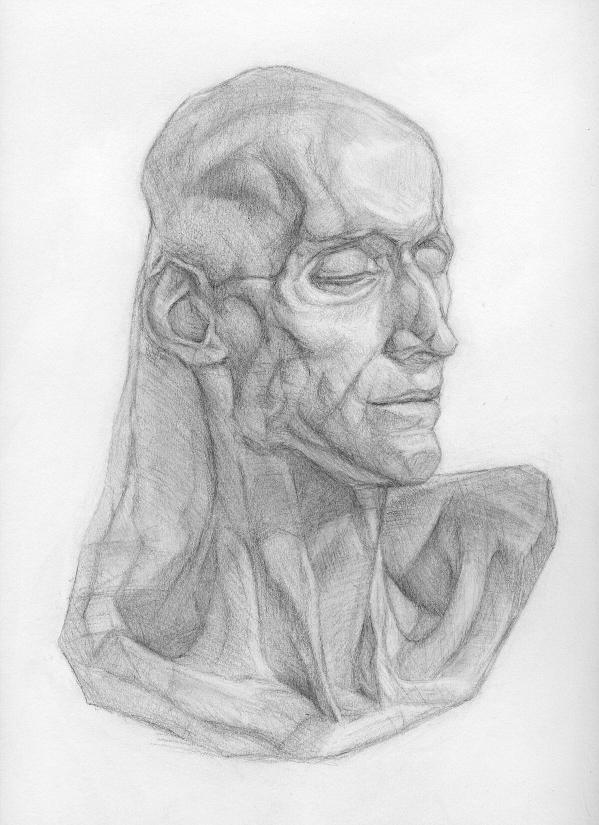
May 18, 2021 at 12:02 pm #1449930Thank you so much, Carolina, Carlos, and Susan, for your feedback! I took a break from the cast series to work on mostly on Master Monday assignments but finally just finished the cast of the cadaver. I felt more confident in terms of accuracy and using lines to follow the form after all the Master Monday sessions. I hope that carries over to the Renaissance bust which I know will be challenging!
 July 3, 2021 at 12:55 pm #1566608July 4, 2021 at 9:02 am #1570879
Wow amazing job!!
-
This reply was modified 3 years, 4 months ago by
SARA MIA FLORES.
July 14, 2021 at 8:53 am #1599865Nice work Jan!
July 22, 2021 at 8:15 pm #1619136Great job!
August 17, 2021 at 3:49 am #1682590October 3, 2021 at 2:33 pm #1811772Really nice work Jan. Your drawing is very good, and I think your rendering is almost there, but is just a little bit flat. For my money there’s not quite enough tonal distinction between the shadows and the lights. Remember that the lightest part of your shadows will always be draker than the darkest part of you lights (for an object of a given local colour). I think there are one or two areas where that relationship doesn’t hold in a couple of your drawings, or at least it’s not stated as strongly as it could be. My feeling is that you are generally over-modelling your lights, and they’re starting to look a bit grubby. You could try carefully rollling a kneaded eraser over the light areas to light off some of the tone without destroying all that work, then going back in a refining things with a harder pencil. The potential is there to make these really lovely though.
October 5, 2021 at 4:07 am #1816425Thank you very much for the advice I really appreciate it.
-
This reply was modified 3 years, 4 months ago by
-
AuthorPosts


CONNECT
New Masters Academy
16182 Gothard St
Huntington Beach, CA 92647
Contact US